Guest DT – LYB (Zach’s Life)

Okay – we were a little late for Week 3 with Ngaire. Apologies – Hubby added on an extra night to our stay at Hotham the night before we were due to leave. Gotta love the man!! Tracy has the post up now on her blog for you all to check out – so I can put this up here now too.

This week we are doing a step-by-step with the gorgeous boy range Zach’s Life from Little Yellow Bicycle. I love the diversity of colours in this range – and the fact they include both bright/funky papers as well as dark/grungy ones. I worked with a bit of each – the bright blue and orange, matched with some grungy browns. Again – the papers are busy – so to tone them down a little we are going to make strips of them and mix them in with less obviously patterned cardstock and patterned paper.

I loved this range when it came out – bought ALL of it – and then for some reason never used it at all. It has been sitting untouched in my stash all this time. Shocking I know. Ahh well, thanks to Tracy I can use it now.

To make things a little more interesting, I’ve done a multi-photo layout (use a 5×7 portrait photo for the main photo with 2 smaller ones to suit). Those of you who know me well will know I do these as often as there is a full moon – so this must be my multi-photo layout for September. Lol

For the full step-by-step you can go here to check out Tracy’s blog.

I love how the title came out – it’s a paper from the range over chipboard alphas, with some Kindyglitz and Dimensional Magic to finish off. That gives it a hint of glitter – plus all the shine of the DM. I’ve inked all the edges too – so it is both grungy and sparkly at the same time.

My fav embellishment on the page would have to be this one. Just a little section of punched paper, some twine, a Tim Holtz Trinket Pin (nifty little thing this is), a gorgeous little skeleton charm and one of Tracy’s felt stars (which was white but I made it Spiced Marmalade). All layered together to make this simple but effective cluster of bits and pieces.

I loved that little skeleton charm so much I used another one on a Buzz and Bloom Spider or Worm (whatever it was). The running joke at my place is that DS2 is a walking talking skeleton pretending to be human – so this little charm was more than appropriate for him. Poor DS2 has grown so fast over the past 2 years his poor old body cannot keep up with him – so he is a little (ok – a huge lot) underweight for his now 6ft height. Add to that the fact that – Skulduggery Pleasant (one of the main characters is a skeleton) – is is favourite book series at the moment and you can see how skeletons are all the rage at my place.

The orange strip is one of the coordinations cardstocks – which I don’t often use – but with some sandpapering it came out really well. I am thinking I need to look into using them more often. And the twine – lol – I started the month off with a huge ball of that – by the end of 3 layouts it is much reduced. Must thank Kars for showing it to me all those layouts ago.

Bit of a milestone this layout. Regulars to my work will know that I am a bit of a portrait scrapper – I like facial close-ups or artsy shots – and rarely do random everyday photos. I’m also not that big on journaling and will often leave it off altogether. Lately though I have done a series of layouts where the journaling is an important part of it and I am more than happy with how that has turned out. A little variety is a good thing. For a while now too I have wanted to do some ‘ordinary’ moments, to record some of the things about our life for the kids. This is one of them and since it hasn’t turned out all that shabby, I might just go on to do more of them.

So here is the journaling – not quite how I said it to him – but you can get the general jist of it.

So that is it for this week – now I have to go off to my cave and think on what to do for my final week of “Boys” with Ngaire. At this point I have absolutely no idea what to do – thinking I need to quickly do a girly one though to get the creative juices flowing and then tackle the boy one

Guest DT – Rose Moka (Equinoxe)

This week for Tracy I again got to play with some Rose Moka – the Equinoxe range this time. Of the two ranges, this is my favourite – the colours work really well together and suit a range of ages and layout themes.

I’ve used them for another grungy style teen layout (after all – I have grungy style teens) – but this time the grunge factor comes more from the distressed nature of the pattern on the papers and the finishing effects on the chipboard, rather than from techniques associated with the paper.

Other than inking the edges and a bit of border punching here and there, I’ve not done anything to the paper itself. The patterns on these papers are already distressed and grungy looking. Of the papers I have used here, only the stripe has a defined, regular pattern, the others are blotchy and irregular – which is something you can make use of to make really individual layouts. Each time I went to cut a section of the paper I looked for the area that would give me the most interesting ‘edges’ and I covered up any sections that were fairly plain and less interesting.

So you can see that for the base paper of the layout – Journal Intime – I’ve only left the interesting script sections around the outside edges showing. Pied de Poule – the central square and second layer of the layout – was cut so that the non-striped corner was included (just above the chippy notebook) – making the 4 corners of the square quite visually different. Baroque was cut to give the main section of it that white corner on the top right – and also so that it left me that lovely mottled white pattern that is the strip above the photo and the horizontal strip that has been border punched (which has the interesting white blotches on either end).

It can take a bit of practice looking at the papers to work out how best to cut them, but when you do this, it often then saves you time, because the layout just flows from there. Putting those layers together gives you the basis for your layout and the rest is simply embellishing.

I am a bit of a pack-rat when it comes to scrapping. I hate to waste anything. One of the things I have noticed with using border punches, is that you get these cool little ‘offcuts’ from using them – and I love to add these to my layouts. Here you can see the black strip has been punched using the Bracket border punch from Fiskars and I have used the offcut (reverse side) a little further down.

It also helps to define the border punch area if you contrast against it somehow. Here, I have added a thin strip of Pied de Poule to do that. It also helps to give a horizontal line across the page that draws your eye between the two sets of cog embellishments.

For me, one of the things that draws my attention on the layout is the Scrapware Chipboard Notepad. I saw them in the store a couple of months ago and had to have one for something else I was planning – but I realised it would be perfect for this layout. To get the effect you see on it, I have inked it with an ochre/buff coloured chalk ink and then wiped the edges with an old semi-dry Pine Cone Versa Color ink. Then I also lightly ‘smooshed’ it about the top of the notepad. Using an old ink pad like this gives you a very soft application of colour – great for when you want just a touch of it and not a heavy coat. If your ink pad is new – simply add a little to your thumb and forefinger – rub them together – and then lightly wipe over the chipboard. Small make-up sponges work well for this too.

The journaling I did on an acetate sheet through my printer. There was a fair bit I wanted to say and using the computer to print it meant that it would fit and still be readable. It’s also difficult to use a pen over chalk ink – even my good Signo chokes.

The cogs on the layout provide the needed variety in texture. Some of them are chipboard ones from my stash (no idea whose – I just have a little plastic drawer full of all the loose chipboard cogs I have bought) and some I made from Grungepaper using my Tim Holtz Cog Die. These dies run fine through your Cuttlebug – you don’t need to buy a Sizzix for them.

The textured surface of the Grungepaper allows you to make some awesome inking effects. The cog on the top right of the layout – and the one here under the dark reddish one – have simply been inked with a variety of inks and then dried with a heat gun. I’ve used a mixture of Aged Mahogany, Black Soot (both Tim Holtz Distress Inks) and Versa Color Baby Blue Ink. To get the mottled effect, simply wipe the distress ink pads across the Grungepaper – only pressing down lightly. Because of the texture on the paper it only ‘grabs’ the ink in spots – leaving a partially inked surface. Always use the lightest ink first, applying the darker inks over it.

To get the glittery appearance of the key (and the blue chipboard cog here) and the top reddish cog in the previous photo – you need to add some Distress Stickles and again dry with a heat gun. The red key/cog has Fired Brick on it and the other cogs have Walnut Stain. Distress Stickles have the added bonus of having small solid particles in the mix that are left behind when the glue dries. You can leave them to dry naturally, but I am impatient and using a heat gun reduces the glitter a little – which I prefer on a masculine layout like this.

I tied the Scrapware chipboard key to the cog with some twine and included one of the gorgeous little Heart Locket charms that Tracy has in the store. It was silver – but I applied a little Pitch Black Tim Holtz Alcohol Ink to it to shabby it up a bit. The matching key to it – also altered – is on the title and there is a Follow your Heart charm on one of the cogs.

Both the large letters in the title and the earlier cog with the twine on it – are chipboard – and have been inked to get the pattern you see. The smaller alphas have some Walnut Stain Distress Stickles as well as ink. The alphas are the fabulous Scrapware Antique alphas – I’ve used a mix of the normal size and the mini.

The chipboard is smoother than the Grungepaper – so you get a much softer look to the inking. For this reason I like to go around the outside edges with a darker colour to help define them a little more clearly. Here I have used the Pine Cone to do that. The buff coloured ink was my base and then the blue went over the top of that – to get the strong blue on the cog I first dried it with my heat gun and then applied the blue with my fingertip. The inking around the edges is the last thing.

The large alphas were a little boring with their soft colours – so to add interest I wrapped some twine about them and tied one of the Key charms to the ‘l’. The twine alone wasn’t quite dark enough, so I inked over it with a little Pine Cone to darken it.

And there we have it, another grungy boy layout, but with nary a ripped paper in sight. The design lines on this one are much stronger – straight lines and lots of blocks and angles. This really suits masculine layouts. The softer colours though, tone down some of the harshness of the lines, as do the embellishments.

I’m on my way to Hotham at the moment (or maybe even there) so there is not much from me until next week. Catch up with you all with some more boy grunge then.

Awol

So this is the last post for a few days. I was hoping to get my cc layout (I actually managed to attend one rather than run one for a change) up but time has gotten away from me and it is not finished. Hubby has decreed this holiday is ‘scrap-free’ – so I am not packing anything to take with me even though my Bo Bunny Cambridge has arrived and is burning a hole in my mojo. Sigh.

There will be another boy layout up later this week for My2Angels – one I am particularly happy with – so keep an eye out for that. Otherwise, I’m off into the wild wet (and hopefully white) yonder for a bit to take snow photos.

Lush Cards

Yeah, I know, things are a little quiet after the posting rush. It’s that time of the term – children who need to be supervised to make sure that assessment is done and on time. All the more important this term because we are about to venture off on our annual holiday to Mt Hotham. Whoo hoo – skiing photos. The only way I get through Xmas paper ranges – since I so suck at getting photos at Xmas.

I made two cards from the Lush range – one for Father’s Day and one as a general purpose card.

Kaisercraft’s Lush collection might not immediately spring to mind as one you could use for masculine cards, but the colour palette for the range is extremely versatile and can easily be used for both genders.

My Father’s Day card makes use of the ‘collection strips’ patterned paper that most ranges seem to have these days. Such a paper is a quick and easy way to get a variety of coordinating patterns that you only need in small amounts – in other words, they are just perfect for cards.

With the masculine theme in mind, I’ve kept the base of the card fairly neutral – using the dirty cream and grey patterned papers – and then used the strips and one of the Journal Tags as the main colour features. Some Kaiser pearls (Yellow and Black) here and there, a clip from the Lush range and a leaf pin from my stash provide all the needed embellishing.

In keeping with the oriental theme of the Lush range, I have also used the script and flower stamps to provide some interest to the relatively undecorated papers that form the base of the card. Using black ink for them allows me to have interest without it being too ‘fussy’.

The general purpose card is one that is quick and easy to make – you know me and cards!! The card itself is one of the ochre Bazzill colours with a wide strip of patterned paper over it. I’ve punched a contrasting paper with my Threading Water punch and then threaded twine through that for a little interest. It is a masculine looking card and the twine was more appropriate than ribbon. One of the name tags from the range gives you an obvious place to put whatever card sentiment you want on it. Mine is meant for my father-in-law and will have his name on it – which is why I am showing it to you without the sentiment. 😉

The cool flower on it was the technique for the week and I have shared instructions on how to make it in the forum at Ideal Papercraft. So check it out there if you like the look of the flower. It has a vaguely oriental feel to it which I thought suited the paper range. It’s actually a nifty little way to use up some paper scraps too.

Absolutely stoked…

Doing a little dance here – happy feet, happy feet.

Kay – the lovely lady I bought the butterflies from for my cc layout – has asked to put up that layout in her Etsy store – on the page for her butterflies.

I am so excited. Every time someone goes to look at her gorgeous butterflies they will see my little layout there.

Hmmm – ok – now that I come to put it like that – that’s a little scary.

So do go and pop in here to see both my little layout and Kay’s stunning butterflies (yep – there are others and all equally as stunning).

Newsletter – Lush (Part 2)

Must be time to show the second layout from this range.

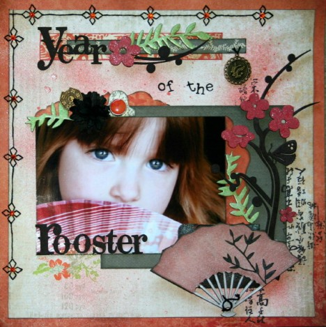
Interestingly – in using the Lush collection I have produced layouts that are not what I consider my traditional style. Year of the Rooster is much simpler than most of my work (the girly stuff anyway), and contains a lot more ‘space’ than I would normally use. I have also fallen back into my old habit of using a brighter patterned paper as a frame for the layout.

There is almost a little bit of everything from the range on this layout. Here you can see some of the patterned paper strips from the Maple paper where I have used them to make a nice title strip for my alphas. The green chipboard leaves are from the collection, but the flower and black chipboard pieces are sections cut from a Twiddleybitz branch and butterfly chippy. The rest of it is over on the right hand side of the photo. I will often cut up such pieces to make them better ‘fit’ the way I want to do my layout.

There is also a paper clip from the range, together with some shaped tags from the 6” Paper Pad. The little black chrysanthemum type flower you see is one I made myself from the small 5cm paper flowers Kaiser make. Trudy – who is on the DT there now I think put up how to make them ages ago but I have not had a chance to use them until now.

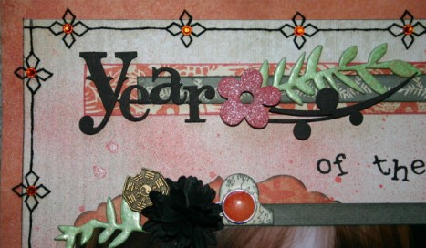
Aside from admiring my lovely little bronze Asian charm (shhh – it’s a phoenix and not a rooster), this close-up allows you to see the gorgeous shimmer from the spray of Coral Reef Glimmermist I gave to the patterned paper that forms my layout base. The Asian script characters are the stamp from the range and the glimmer on the chipboard flowers is due to some Tim Holtz Rock Candy Distress Stickles.

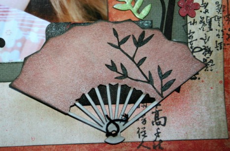
I originally had another embellishment here, but the chance pick-up of this little Scraplets chipboard fan was too perfect not to use on the layout. This time I muted the Coral Reef by rubbing over it with some white chalk ink, once the Glimmermist had dried. With the fine pattern on the fan I filled in the grooves in the chipboard with my trusty black Signo pen.

In keeping with my theme of little bits here and there- I inked only sections of the Asian script stamp and randomly stamped parts of it here and there on the layout. And yes – I do know that some of them are stamped upside down. It looked better that way – I will just hide this layout from anyone who is able to read it.

The journaling for this layout is popped behind the fan in one of the Maya Road Library Card Envelopes. I Glimmermisted it black to make it blend into the background and although I have not used the library card itself, there are some journaling cards I made in there that talk about how Madame was born in the Chinese Year of the Rooster and what personality traits she is supposed to have as a result. Lmao – supposedly she is honest and forthright, domineering but friendly and loves pretty clothes, talking and shiny jewellery – so maybe there is something in it after all.

Just a close-up of a lovely rubon from the Lush colour rubon pack – again I often cut up my rubons to use in different parts of the layout and this is a partial piece of a larger rubon. The original is simply too large for this little corner, but this snippet is the perfect size. And yes – stitching the fancy border took waaaay longer than it should have.

Oh – I almost forgot – those alphas – aren’t they gorgeous?? From Scrapware – some gothic script. Love em. Almost need to go back for more I have used them so often this month.

I have to find my last Lush layout now. Totally distraught – put it somewhere safe before I took photos and it is sooo safe I cannot find it. There is a card too – so I can put that up tomorrow.

Guest DT – Rose Moka (Mec)

Hi ladies – here is the first of the layouts I have done as a Guest DT this month at My2Angels. I think I have known Tracy as long as I have been scrapping. We both used to shop at the same store on the Coast and would meet at the classes there. She and her Mum would laugh at the fact I did mine without photos with me and I used to look at and buy (under the table of course) 😉 the lovely silver charms they brought with them. Lol – I still have some of those charms in my stash – but I am working my way through them.

I followed her to ebay (the Coast store had closed down by then) and finally – was very excited to see that she had opened her own online store. Whoo hoo – and of course it is going great guns now. I am thrilled to get this invite to come scrap some layouts for her and can’t wait to share them with you over the next month.

I had to laugh when Tracy told me the theme for my DT month was boys – with 3 teen males I figured it wouldn’t be too much of a problem coming up with suitable material.

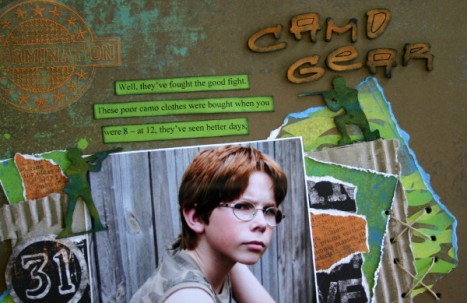
Having a poke around in the store I found the Rose Moka Mec range for my first layout. It’s just perfect for this photo of my DS3 sitting out in the backyard in his camo gear. These much loved clothes now blend better with the rag pile than what’s in his cupboard, but there is no way he is giving them up yet. The state of his clothes suggested a grungy sort of layout – so distressing was the name of the game.

Often you get bits and pieces of patterned papers that are left over from other layouts – not enough to make something in their own right – but too much to bear throwing out. These are usually the bits that I use to make cards – but since I am not a card person that only happens when I have one that I actually need to make. I hate to throw anything out though –so usually the bits get put back with the papers and kept for later. Lol – a lot later. Mixing and matching them together to make a grunge layout is a great way of making sure they don’t go to waste.

I’ve ripped up bits and pieces of the Fort (I used both sides) and Positif papers and then mixed them up in layers with cardboard from a packing box and some bits of the Dusk paper (again – I used both sides) from Pink Paislee’s Twilight range.

The alphas you can see are Buzz and Bloom – the trusty Urban font, which I have inked to grunge them up a bit. The colour is a mix of the Tim Holtz Spiced Marmalade Distress Ink and an (name unknown) orange ochre Colorbok Chalk Ink. Together they were a perfect match to the orange-ish ochre colour of the Dusk reverse side. For a little added grunge I inked around the edges with a black chalk ink and swiped it lightly over the top of the alphas too.

The stamp is a Teresa Collins sporting one – but Tracy sold out of them before this layout was finished.


The main embellishments for the layout come from the Scrapware Army Men chipboard set. These are really cool – and to get that camouflage look to them I dabbed them with some blue (Tim Holtz Broken China) and lime (Luminarte Radiant RainKeylime) inks, which – where they blended – gave me a darker green third colour. Then to tone down the brightness (and the sparkle from the Radiant Rain – I mean who ever heard of sparkling army men??), I smudged a little black ink over them.

The tags (and also the flag on the other side of the layout) are also part of the Army Men set – again I have inked them and then added the symbol and writing (a rubon from somewhere??). The chain came off a clothing tag (thanks Veronica’s and Madame) and was just what I needed for the tags. A few twine cross-stitches here and there also help add to the grunge factor.

Here you can see that I varied the techniques I used with the patterned papers – tearing, inking, distressing, sanding – I used the lot. I also like the way that using the papers in small areas like this can allow you to include a paper you might not normally consider. The Dusk paper is a Halloween one – but with the words on the paper all ripped like they are, you cannot see that. Even the 31 fits here – though it has no significant meaning – it just looked good there. Lmao – to be honest the real reason that the reverse side of the Dusk paper is included at all is because I was looking for ‘something’ extra that the layout needed (it was almost done at that point – I was just gluing things on) – and then I noticed that the reverse side was almost the same colour as DS3’s hair – so yep, it had to go on there then. Shhh though – don’t ever tell him that.

So, I have a layout that is as grungy as the clothes and one very happy Tween. I hope the layout gives you the courage to gather up all your left-over bits or rip right into whole pieces to use together on your layouts.

I had great fun with this layout – so not my usual style – and a complete break from all the flowery goodness of Madame’s layouts. Next cab off the rank is DS2 – I think – possibly a good time to do the ‘Mutinous Much?’ layout I have been threatening him with. 😉

CC challenge layout (Prima Annalee)

So the Inspiration from Advertising cc is up and running.

I have Challenge 1 – and my source of inspiration was the packaging I got with a recent Prima purchase. Now they have always had lovely packaging – but this time they have outdone themselves. For the first time I found myself putting the flowers to one side and playing with the packaging instead.

My criteria are:

1. Must recycle some aspect of your scrap packaging.
2. A butterfly
3. The theme for the layout is change.

I’ve expanded on those criteria in the forum post here – but we would love for you to pop in and join us for a chance at winning a $15 store voucher.

And here is my layout:

The papers are from the new Prima Annalee range – just gorgeous aren’t they? I’ve only used the 2 pieces of double-sided paper on the layout and a sheet of French Silk Bazzill cardstock. Amazing what you can do with so little.

Oh – and ok – a few flowers and butterflies. 🙂

So check out that cardboard backing sheet first – how gobsmackingly gorgeous is that? Better than a lot of journaling die cuts out there. All I had to do was trim the brand name off the end and give it a bit of chalk ink along the edges and it was set to go.

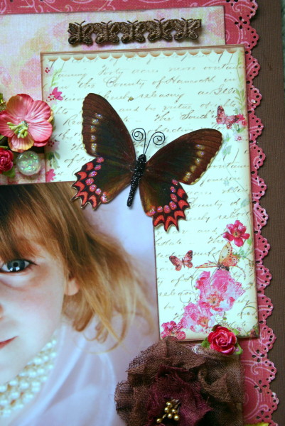
I got the idea for the whole layout and colour combination from the fortuitous accident of putting the butterfly down on the packaging base while I looked at something else and then noticing how well they went together. It’s almost like they were made for each other.

Here’s a close-up of the butterfly – just look at that sparkle. I bought it off a lovely woman on Etsy called Kay – and her other butterflies are just as stunning. I got a selection of them (they come in sets of 3) and can’t wait to use them on other layouts. I can see me going back for more too.

The link to Kay’s store is here – so go check out her wonderful creations and buy some butterflies of your own. I found the shipping rate to be more than reasonable.

The flower cluster is a combination of an older Prima vine and some small white roses I altered myself. There are two shades of Twinkling H2O’s Sunset Glow and Playful Peony – and the Sunset Glow got a layer of Crystalina Kindyglitz over the top for added sparkle. I finally got to use my Webster’s Pages Sparkler somewhere too. The Olive Green crystal pin is from a collection of them that I got from Jo at Sugarsnapps.

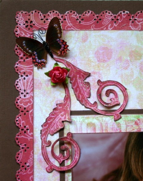
This butterfly got a trail made from a rose and some flourishes cut from the pattern on the Ashton reverse side. The base of the layout is the same reverse side – all I did was use my Martha Stewart punch set to give it some interest. The dark chocolate French Silk cardstock provides a good base for this brighter paper. The next layer of paper is the centre section of the Sonnet paper. I cut the outside border out to use elsewhere on the layout and just inked the edges of the centre piece. I love the soft patterns and colours on this paper – the floral main side of it is just stunning too and I can’t wait to use that on another layout.

Another of those stunning butterflies – and here are the border pieces from the Sonnet paper. I used one strip as a base across the bottom of the page for the title and the rest I cut up to make a matting underneath the photo – with just a centimetre or so showing.

The alphas are some yummy Gothic ones from Scrapware and I coloured them in with some Choc. Cov. Cherries Glimmermist. This is the perfect colour for the pinks/reds in the layout, because the chocolate colour of the Glimmermist has a pinkish-red shimmer to it.

More of the Prima flowers and a Prima Pebble, together with a gold key charm are all that is needed to finish off this corner of the layout.

More Prima flowers and Pebbles and my own floral masterpiece!! After seeing the ones that Tracy at My2Angels made for me I couldn’t resist having a go myself. The outer parts of the flower are the Choc. Cov. Cherries Glimmermist, but to the inner layers I added a little Raspberry Alcohol Ink (Tim Holtz) to give a slightly pinker look to the centre. The little gold stamens that finish it off are also from Tracy.

The journaling (hidden behind the photo) is just an observation on how I started out with a little girl playing about with her pearls and wrapping herself up with some organza curtaining material into a cocoon – and ended up with this diva model child emerging out the other end of the fabric folds. Definitely not happy to see her growing up so fast. Change – anyone know how to stop it??

It would be great for you to join us at the cc – there are 2 other challenges to have a go at and games in the forum over the next week. And as always, there is the friendly natter in the forum. We’ve love to see you there.

June Take 5 – The Layout (finally)

I have given up waiting on my computer to get totally repaired. They have the new motherboard in but there are issues with the hard drive accessing all the bits on it. I don’t want to know – I just want it fixed – soon – please. I have been very patient waiting for it I think – no-one has lost a limb…yet.

So I re-wrote what I remembered this to be – hopefully I got it all right.

So this month Shazza won the suggestion choice with her list of:

Distressing
Blue and brown
Ribbon/lace
Flowers
Stitching

Although I did not have the lovely range she suggested, I think you will agree that the IOD (CI) Beloved is just as gorgeous. Lovely soft blues, browns and creams. Just perfect for the sepia photo that was June’s Take 5 photo.

For the distressing I curled the edges of the blue base paper – it’s easy enough to do if you use a wet brush to damp down the paper first – and then I ripped some of the edges in a bit. The dark brown paper was distressed using my trusty Heidi Swapp edge distresser. To further distress this patterned paper I also pleated in one corner and used a ribbon to tie it up. Again – the easiest way to do this is to wet the paper first until it is easy to move – then scrunch it in – in the middle – to pleat it.

I’ve also used some co-ordinations cardstock for the little blue hearts that I have dotted here and there. A good rub over with a bit of sandpaper, a quick wipe-over with a grungy brown chalk ink and you have perfectly distressed hearts every time. (shhhh – I know giving them a coat of Kindyglitzkind of un-distresses them – but you gotta have some glitz).

And finally – the chipboard got a similar treatment. First a coat of a light cream ink and then grunged over with the brown. To finish it off I added a layer of Rock Candy Crackle Paint. Love the cool old-world feel that gives the chippy.

I’ve used ribbons and lace in several ways. There is a tiny blue satin ribbon that is tied in a bow around the crystal pin (on the right hand side of the layout) that holds the key and lock charms. Plus there is the one I mentioned previously tying the patterned paper corner in place. I also used that gorgeous May Arts Butterfly ribbon that Mary has in-store. Gorgeous, gorgeous ribbon it is. I’ve simply twisted the ribbon to make it look more interesting and coloured in the Butterfly with a little pale blue Twinkling H2O which was then grunged over with brown chalk ink.

The little heart you can see here next to the ribbon is one of the IOD sticker ones.

I made lace flowers from a little bit of lace left-overs I had lying around. They are very easy to make. Run a thread in and out along one edge of the lace and then pull – this bunches up the lace and curls it around. When you have enough to meet the other end (in a circle) you can stitch the two ends together and pop something in as a centre. A brad or Raja centre would work – but I like the little blue roses I popped into the centres of mine. I also tucked a couple of small bits of lace into the larger rips in the patterned paper edges.

Here you can see one of each of the different flowers I made.

The stitching is actually a tracing of the white butterfly flourishes on the brown patterned paper. I simply copied them and then pricked out the pattern onto the paper. You don’t want to know how long the stitching part took – believe me!

The flowers are all Prima white roses. I coloured them in with Frost Glimmermist or a pale blue (sorry – the name has worn off the jar) Twinkling H2O. The larger ones also got a grunging over with the brown ink. The small brown roses are also Prima – there’re old ones I have had for a while.

I used another feather Maggie. Lmao – this one came out of my feather doona (we have a small hole in it that leaks the odd feather now and again). Waste not, want not – the colour went well with the layout so I shoved it on – just next to the jewelled pin.

There are also two little silver charms from My2Angels on the pin – the cute little heart and locket. How sweet are they?? You can get them from Tracy here in her charm section.

So there we are ladies. I hope you like my interpretation of the challenge criteria. I love my layout and Madame adores it – so very happy campers here thank you.

Thanks everyone who made suggestions – they were all great. I hope you all come back to have a go at August’s Take 5. I can’t wait to see what you suggest.

Oops – missed one – Oceana (from June)

It has been pointed out – quite correctly – that I missed a layout from the June Oceana Newsletter – and since it is one of my favourite layouts, I have been shamed into making sure it goes up here on the blog. The photos of Madame running along the beach in her turquoise tutu and halo are some of my all-time favourites. She had such a ball playing beach fairy (she had just been given the Fairy Beach DVD and this was her answer to Bubbles).

In – Under the Sea – I’ve tried to show how the embellishments can be used to make the layout, rather than the patterned papers. The style of the layout is also what I call a ‘photoscape’ – where you have tried to put the photo within a scene that extends the photo into the layout. The idea is to give the illusion that Madame is looking into a rock pool at all the things she might see in there.

There are lots of elements in this – and I do admit that this is one layout that took a LOT of time to work out and actually put together. The base to it was a piece of white cardstock that I randomly stamped with Coral Glimmermist using bubblewrap. Over this went some green mesh and then a piece of the gorgeous Under the Sea (reverse side) and the photo.

This is a perfect example of what I mean when I say that the Foiled Tags and Shapes are as good as a small paper pad – here I have used a shell shaped tag as my base, together with a starfish sticker and a chipboard seahorse (from the Tidepools range). I’ve inked the edge of the seahorse a little to help him match in with the colours of the layout and to make him stand out more. The flowers are Glimmermisted with some coloured freshwater pearls from my stash as centres.

Fish stickers, a chipboard flourish and more flowers fill in the top corner over the green mesh.

Along the right edge of the layout I have used more stickers and foiled tags to create my little ‘scene’. I also cut out some of the seaweed from one of the patterned papers and added it here and there about the layout.

I’ve used the chipboard flourish to try and separate the title from the scene a little and to keep the whole wave and water theme happening. The title is a stand alone dimensional tag – but I lifted the letters off it and did not use the base of the tag. Repositioning part of the title onto a Foiled Tag allowed me to keep to the colour theme I had in mind (the original tag base is a sandy beige colour) and to position the entire title in a way that suited my layout better than the shape of the original tag. So don’t be afraid to alter embellishments like this if it suits you better to pull them apart to use them.

Now Mary still has some of the gorgeous range in store – and since we are coming up to Summer (soon, please, I am sick of the cold and rain this weekend) – it makes a wonderful range to work with all the beach photos you know you are going to take. I am planning a few more layouts with it – as Madame went to her Prep Ball last month (the theme was Sand and Sea) as a mermaid and the colours are perfect for her costume. Mary also has some more embellishments (some chipboard borders that are a late release from Creative Imaginations) coming too – so grab some before I come back for a restock.

I think this is my only catch up – back to Lush tomorrow.