Kaiser ‘Garage Days’

So it has been awhile since my last post. 😦

Not what I had planned, but life has been very busy and I’ve not had time or energy to devote to my scrapping. I did, however, very much like this new range by KaiserGarage Days – and so I decided to spend a little time putting this layout together for Madame.

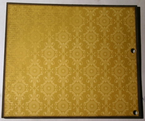
It’s a nice, grungy masculine range – a bit vintage in the image choice (which you either love or loathe), but you can ignore the images and use the cool colours and patterns if you are so inclined. The blues, reds and yellow work together really well and there is a fabulous ledger page to provide a contrast to all that colour.

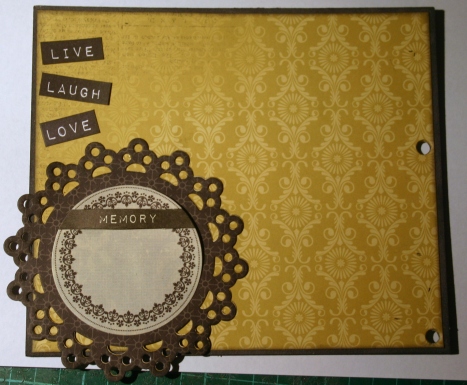
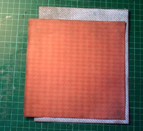
I started off with a piece of Workshop – but rather than trim off the Manufacturer’s Strip at the bottom – I left it, and trimmed off some of the paper from the top.  I also inked every paper edge on the layout with Versa Magic Jumbo Java, just to grunge it up a little more.

IMG_4058

Then I added a cut-down section of Wheel Alignment. Love this pattern – and the contrast to the orange-red is simply awesome. To get this clean neat look to the two papers, use your craft knife to cut the edge of the title shape around the top half of the shape. Then slip the smaller paper in under the title shape and adhere. Now it looks like it is just the one piece of paper/design.

IMG_4059

I’ve then added in a section of the ledge paper – Nuts and Bolts – to provide some contrast to all that colour. As you can tell by now – I’m going for a layered look for this layout, so I need something for all the colours to contrast against and the ledger does that nicely.

IMG_4065

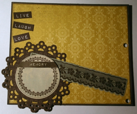
I used a little of one of the papers from the Paper Pad here, but you just as easily use a bit of Workshop if you didn’t want to buy the pad.

IMG_4068

Another piece from the Paper Pad, overlaid on a section of Gas Tank 

IMG_4071

and adhered over the ledger paper. The layering works as it repeats patterns (the diamonds) and colours (red and blue) – you end up with a complex look to the layout without much effort (well – without much apparent effort).

IMG_4073

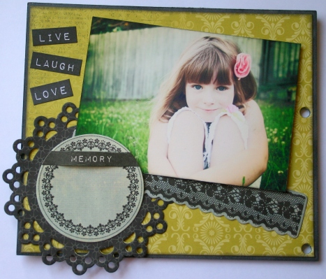
Finally – the photo. Madame and her adoring Daddy sharing a moment together out in the backyard. If she looks a little smug at getting a cuddle – it’s probably due to the fact that it was me getting one 5 mins before, until she came and usurped my spot. *roll eyes*

IMG_4074

I had a bit of a dilemma at this point – I liked the layering so much I didn’t really want to hide it under a tonne of embellishments AND my poor brain is still a little fried, so simple was very appealing to my level of creative ability just at the moment. I’m having a bit of a ‘funk’ and rebellion at all the medium heavy and ‘tonnes of stuff’ trend at the moment, so I decided to keep it simple and see what came of that.

IMG_6380

I popped together a small cluster of assorted cog/gear bits that were left-over from other layouts – along with a couple of die cuts from the Collectibles pack, a small flower and a wayward bit of twine.. Some are only pieces of cog, whilst others are the full thing – and they have been inked with an assortment of inks (metallic silver, black and white with a light coat of Kindyglitz) to match the colours of the papers.

IMG_6381

Another smaller cluster used some more of the spare cogs/gears (some are wood and some are chipboard), another flower and another die cut from the Collectibles pack.

IMG_6383

I also used a diamond pattern die cut strip from the Sticker Sheet – but over the top of it I added a rubon from the Rubon Pack. As usual from Kaiser, it didn’t work properly the complete length of the rubon, but since it is a grungy sort of layout, it didn’t worry me too much.

IMG_6378

The only problem with the rubon was that it wasn’t long enough to do the entire width of the page. This left me with a section of the diamond pattern die cut strip that would be without a rubon overlay. To hide this missing section I popped the largest embellishment cluster underneath the photo and over the top of the missing rubon section.

This time I used an assortment of cogs and wheels from my stash. They’re all chipboard and probably from a range of different companies. I kept to the same selection of inks – but added in a grungy light blue I found that matched the blue in the diamond pattern of one of the papers.

The final element was a tag I made out of a left-over bit of the ledger paper and a piece of twine. I popped a note on it about how much Madame loves her Daddy and cuddles with him. She’s getting to that age where she is leaving the ‘kiss goodbye’ out of the parting routine at school – so Hubby is treasuring his cuddles while he still gets them.

IMG_6385 skewed

So here is the final layout. Looking back at it now I am not sure that I like the simplicity of it after all – I might just have another play with it over this week. Browsing through the store pages for these papers I noticed some of the other store items that Tracy has popped in as suggestions – and there are a number of charms I want to add now – along with some of the new stamps Kaiser released with this range. If I add to it I will repost the new version.

Garage Days is an awesome range to play with – I do like the way it suits a girly/daddy layout – as well as being great for all types of masculine layouts. DS2 got his P’s not that long ago – so I can’t wait to do a layout for him to celebrate that – and the car theme of this range is just perfect for that.

So check out the store for Garage Days, you won’t be disappointed.

Twiddleybitz Gate Mini Album (Tutorial) Part 5

Looking now at the reverse side of the shaped pages in the mini – I had to use this gorgeous paper from the Paper Pad. I really wish they had made this as a 12 x 12 sheet.

IMG_3400

Starting off – a section of one of the floral die cuts from the Collectibles Pack. Now I have already worked out that I am putting a portrait photo on the right side of this page – so with all the other elements I am looking to frame that photo.

IMG_3402

At his point it is easier to add the photo – but not fully adhere it – so that you can tuck the various elements under it. Over the section of gold/white floral die cut I have added a section of a black/white one.

IMG_3404

At the bottom of the photo I have added a section of gold/white lace Collectible. This helps to ‘balance’ some of the same colour at the top of the photo.

IMG_3406

To hide the end of the lace strip I added a word tag, also from the Collectibles Pack. It’s not only a good contrast to the colours, but it adds a sentiment as well.

IMG_3408

Now I add in some dimension with a die cut butterfly to the floral elements at the top of the page.

IMG_3410

Another black/white floral section to the right of the photo …

IMG_3412

with another of the small flowers over the top of that to add texture and interest.

IMG_3414

In behind the photo is another tag. When the album has finished being on public display I will add in all the journalling.

IMG_3416

And the final page as it is in the mini.

IMG_3561

Turning to the small circle side of the page – again I have used a paper from the Paper Pad. I probably should have used the same pattern – but I really wanted to save some of that pretty blue/black paper for a layout, so I used this pattern instead.

IMG_3392

Over the top of this went the Collectibles die-cut tag that I wanted to make a feature of. I’ve only glued it down in the middle, as I want to add elements underneath the edges.

IMG_3394

For this page I wanted one of those pretty Fine Fern Leaves Assorted (FER002) stems. All I’ve done to the leaves is to roughly wipe a Distress ink pad across them (Weathered Wood) – the coverage is mottled – which makes it look very interesting in real life.

IMG_3397

I’ve tucked some muslin from my stash under the tag and then layered the chippy leaves over that, with a couple of the small flowers I’ve been using throughout the mini over the chippy leaves.   It doesn’t take much for this to be a gorgeous little page.

IMG_3398

The final touches on the finished page are some small butterfly charms from my stash.

IMG_3526

The final page in the album uses the gorgeous Olive patterned paper. I’ve cut it so that the lovely little pear pattern is hard up on the left side of the page.

To add some interest, I’ve cut a section of the border strip from the reverse of Thyme. I love the contrast this has against the gold pattern of Olive.

IMG_3418

Again – knowing that I have a landscape photo for this page – I am adding my embellishments to frame that. So down on the bottom right of the page I have popped in a little section of lace punched Apple.

IMG_3420

Because my section of Apple was not quite as long as I needed it to be – I cut the bottom punched section off and tucked it just under my striped strip and then did the same at the top with the rest of the piece of Apple. The striped strip hides the join and gives me the length I need.

IMG_3422

Now it is time to pop my photo in …

IMG_3424

and to add in some layered Collectibles butterflies …

IMG_3426

some layers of floral segments left over from earlier pages …

IMG_3428

a couple of word tags …

IMG_3430

a glass cabochon I made myself from one of the letter circles from the Pickled Pear Collection and then finally …

IMG_3432

finishing it all off with some more of the of the border strip from the reverse of Thyme.

IMG_3434

And here is the final page as it looks in the album. I’ve added in a small bronze butterfly charm from my stash to the top border strip – just to finish it all off.

IMG_3524

Thanks so much for following along through the album with me. I hope it has inspired you to have a go at your own mini album.

Twiddleybitz Gate Mini Album (Tutorial) Part 4

Not sure what happened with these last posts – they disappeared completely from my blog and I didn’t even notice. I lost another couple of ‘in progress’ photos for this page too – so we start with the page covered in a section of pattern from the Pistachio paper.

I added the photo so that most of the lovely pattern along the right edge and top was still visible. To complement the black butterflies on the patterned paper, I added this lovely Twiddleybitz Butterfly Ornate Corner (COR007) – I have altered this – in that all but one of the small butterflies was cut off the end of the corner (you will see them pop up later on other pages). The chippy medium is Black Kindyglitz left to dry naturally.

IMG_3361

Here’s a close-up of the chippy so you can see how cool the Black Kindyglitz looks.

IMG_3556

Underneath the photo I tucked a strip of black lace die cut from the Collectibles pack.

IMG_3363

To hide the end of the lace strip and to add some dimension and interest, I cut out a butterfly from the patterned paper and popped that over the same butterfly element on the page.

IMG_3365

Then I made a small tag using scraps from the Pistachio paper and a bit of black crinkle ribbon.

IMG_3570

After popping the tag underneath the photo, I added one final touch – a small hand cut butterfly to the piece of leaf (in the photo) that my daughter was looking at.

IMG_3554

Continuing on – we come to the cool shaped pages in the album. Again I’ve inked around the edges of the chipboard before covering it with patterned paper. This time I’ve used the Chartreuse paper.

I find the easiest way to add patterned paper over a shaped chipboard is to trace the shape onto the paper and then trim it down before gluing it on. Then you can just use a bit of sandpaper to ‘clean’ the edges a little of any overhanging bits.

IMG_3368

Just to add some interest – before gluing the paper down I stitched a border around it with some cream thread. I used my Tim Holtz ruler along the straight edges, which is why they look so neat and hand punched the holes along the curved edge.

IMG_3371

To build up the layers on this page I started with part of a tag (it was left over from another page) from the Collectibles pack. Over this I popped a partially circular shape I cut from the reverse side of Chartreuse.

IMG_3372

At the bottom of the page I added another tag element from the Collectibles pack – this time it is pop-dotted for dimension.

IMG_3374

A few bits of leaf/flower die cut – also from the Collectibles pack – and this page is really starting to take shape. The small pattern on the background paper doesn’t really do anything for me – so the trick is to use it’s ‘darkness’ as a foil for the other elements you pop onto the page.

IMG_3377

One of my favourite elements of the Collection pack is the selection of cards with a word list – this one adds a pop of colour to the middle of the page and helps to hide some of the dark background paper.

IMG_3378

And now for the finishing elements – two gorgeous Twiddleybitz butterflies. The smaller butterfly comes from the Butterfly Ornate Corner (COR007) (I just cut it off the end of the one from the previous page) and the larger butterfly is one from the Butterfly Mix Bag of 3 (BUT001).

To get that gorgeous sparkly colour, the chippy has a coat of gold ink with some Diamond Dust sprinkled over it.

I do have to admit that at this point I wasn’t quite happy with this page – it needed something else, I just wasn’t sure what – it was ‘almost’ done. So I put it to one side to finish the other half whilst I hoped for inspiration to strike.

IMG_3380

The small circular page got the same treatment as the other side – and I do have to confess that punching all the holes in this one was a pain. You can see the stitching isn’t quite what it should be.

IMG_3383

Here’s the other half of the Collectibles tag from the matching page. I loved the tag – but it was too big to use on the small pages in this mini and also have other elements with it. When this happens I often cut the tag into pieces so that I can use them in multiple places or feature specific parts of them. This time I really only wanted the thin edge of the tag to offset another element in the page design.

IMG_3384

So here is the other element I wanted the tag fragment to offset -a lovely flower cluster from the Collectibles pack.

IMG_3387

Over that I popped the full tag with it’s gorgeous butterfly pattern and sweet sentiment. To finish the page I added a small flower from my stash – the ones I have been using throughout the mini.

IMG_3388

And here are the two completed pages together. As you can see, I finally did have an inspiration and added a small section of a gold/white floral die cut from the Collectibles pack to the top of the word tag. The bright colour supports the gold of the butterflies and adds a bit of colour pop to the page.

IMG_3520

True Romance – a double layout

I don’t do doubles all that often – about as often as I do multi-photo layouts – so it makes a nice change to work on a multi-photo double layout. There has been a lot going on over the past few months and I’ve not had much time to scrap and I am doubly pleased to get something finally completed.

The range is one of the two new Kaiser ranges for June – True Romance – and it is a sweet and pretty range, just perfect for feminine, shabby chic style layouts. I had some sweet and pretty photos of Madame playing around in her new ‘favourite’ outfit – so it was a match made in heaven really.

The dominant shades in the range are pale blues, greens and pink – with a slighter darker reddish pink for contrast. Themes in the range include some gorgeous pink roses; birds with their cages; and lots of lovely luggage tags. All very girly and pretty. Madame was enchanted with the range.

For the base of ‘Cherish Life’s Moments’ I used the reverse side of the Affection paper – but I cut it out as a frame, so that I could use the smaller piece as well. Over this went a slightly smaller piece of the reverse side of Faithful and then over this went the cut-out bit of Affection. I really like the old-fashioned script you can see on this paper and being a background pattern, you can pile heaps of other things over it without missing out on anything really pretty.

I distressed all the paper edges and inked only the base paper. Rather than use other paper layers, to embellish the page I added a paper doily and some hand cut roses/tags. The larger of the two tags comes from the Desire patterned paper. The hand cut title letters on it are from the First Sight  paper.

The fussy nature of the hand cut flowers/doily make the layout look a little busy – so I kept other embellishments to a minimum.

IMG_5639

I love these filigree edges – the Twiddlybitz Wrought Iron Mantle (WI004) – it’s so easy to pop them alongside a photo to make an interesting border piece. This one has been inked with several layers of ink to get that lovely mottled pattern. The first layer was a mid-dark grey ink. Over that went a layer of white – but very sparingly – and then random bits of white ink dabbed here and there. You end up with a variety of greys and some white splotches – all very chic and shabby.

Over the top I popped some hand cut roses from the Adore paper and the daughter charm from the Daughter Pink Charming Rose Chain. I embossed the charm (and all the other bronze charms on the layout) with some Stampendous Aged Embossing Enamel Ivory – but I need to make a note not to do this again with the ‘text’ still inside the charm. 😦 Obviously the glue didn’t like being heated – oh well, you learn as  you go.) The cream pearl is part of the Cream and Antique Bronze Keys Charming Chain set (oos) – I’ve used the rest elsewhere on the layout.

IMG_5634

In the top right-hand corner of the layout is the rest of the Daughter Pink Charming Rose Chain set. I’ve curled over a bit of the top paper edge and tucked some more hand cut flowers from the Adore paper underneath the edge – just to fill this empty bit of corner.

IMG_5638

I like to layer other embellishments on my chipboard pieces – here I’ve added some more hand cut flowers and the rest of the Cream and Antique Bronze Keys Charming Chain set (oos) – to the Twiddleybitz Eiffel Tower (EIF001). Like the other chipboard pieces on the layout (the exception being the title) the Eiffel Tower has been given the grey/white inking treatment.

The Twiddleybitz chipboard title – Life’s Moments – has been treated with Stampendous Aged Embossing Enamel Ivory embossing powder – which gives it a lovely creamy white colour with gold flecks through it.

IMG_5630

Underneath the photo I added in a Large Antique Bronze Key charm and one of the tag pieces from the Perforated Tags Sweetheart patterned paper.

IMG_5633

The second page of the double showcases Madame’s (current) outfit. It’s a very pretty, feminine tulle skirt and crocheted top from an Australian company called Dollcake. (They make the MOST stunning clothes for girls – and very reasonably priced for what you get. There are time I am envious of her and wish that they made them in adult sizes.)

I’ve used the same basic patterned paper arrangement as for the left side of the double and kept to roughly the same elements.

IMG_5628

The filigree work on this Twiddlybitz Wrought Iron Mantle (WI004) is a nice match for the crochet work on the top. The top was the inspiration for using the doily as well. The roses and charm embellishment is one I made up myself from various left-overs. It came up rather nice I think – and I can see myself making a few more.

IMG_5621

All of the hand cut flowers come from the Adore paper and the two tags are again from the Perforated Tags Sweetheart patterned paper. I trimmed off the perforated bits and inked the edges to hide that they were once perforated.

IMG_5625

The final elements in the layout are the gorgeous tag that came with the skirt/top and in keeping with the dress theme – I added in one of the Twiddleybitz  Vintage Miss Mannequins (VTG001). They come in a set of three – this is one of the plain designs. The “K” bronze charm is from my stash, but the rose next to it is one of the ‘left-overs’ I used to make my other embellishment.

IMG_5624

So there you have it – my first layout in several months – and a pretty feast of girly sweetness. Check out my2angels for the Twiddleybitz chipboard, True Romance papers and bronze charms I’ve used and have some fun making your own shabby chic creation.

Timeless

I meant to post this up last week, but I’ve simply been too busy. It’s week 2 of the Twiddleybitz “word month” and this is my contribution to it (even if it is a little late) 😦

I started with this lovely photo of my daughter. It’s a timeless moment – she’s caught between the innocence of childhood, with just a hint of the teenager she will become showing through. The colours in it are perfect for the new Prima Engraver range. All those lovely browns and creams – and it’s easy enough for me to add in a bit of blue to match her eyes.

I started with a sheet of Black Leaf, which I distressed and then inked with some Tim Holtz Wild Honey Distress Ink. Then I cut out the middle section so I could use it on another layout. Over the hole I placed a sheet of Cessello, which was also distressed and inked with Wild Honey Distress Ink. For my photo matt I collected a selection of paper strips from Cartouche (the ruler sections), Bank Note (the script section) and Calligraphy (the 2 inked sections on the left and right and the grey section behind the photo) and arranged them until I was happy with how they looked behind the photo.

IMG_5152

Most of the edges of the patterned papers are inked with Wild Honey Distress Ink. The section of Bank Note (the script) has Vintage Photo though, so as to provide a bit of a contrast. There’s a piece of Tim H0ltz Ideal-ology Film Strip Ribbon tucked in front of the script paper

This gorgeous little chipboard corner is actually half a Twiddlybitz Wrought Iron Mantle (WI004) – I simply snipped it along the middle. It’s been inked with  Wild Honey Distress Ink and then given a light spray of Iridescent Gold Glimmermist (oos). It fills the empty space in the corner without being over-powering.

IMG_5146

In the top right corner of the layout is an embellishment cluster made up of a distressed, inked strip of script paper (there are a number of different papers in the range you can use for that), a piece of Tim H0ltz Ideal-ology Film Strip Ribbon, a segment of Twiddleybitz Fern Leaf Large (FER003), an Antique Bronze Clock charm , a brown rose from the Engraver Roses collection and a Glass Cabochon that I painted the underside of with some Blue Suede Shoes Glimmer Glam. The fern leaves were given a coat of Vintage Photo and a light spray of Iridescent Gold Glimmermist (oos). You can just see the shimmer on the leaves in the photo.

IMG_5139

On a couple of sections of Calligraphy I used my Vintage Photo Distress Stain to make a few ink splots. The bronze key is from my stash.

IMG_5149

From the Calligraphy sheet I cut out one of the watchfaces and popped it under the photo. It’s partially hiding another of the Twiddelybitz Wrought Iron Mantle (WI004) pieces – this time left in one piece.

IMG_5151

In the bottom right corner of the layout is another embellishment cluster. I’ve tucked another strip of the Tim H0ltz Ideal-ology Film Strip Ribbon, and a segment of Twiddleybitz Fern Leaf Large (FER003) under a Bronze Filagree Border.

The leaf has been cut out of the reverse side of Roulette and then inked with Weathered Wood Distress Ink and the flower is from the Engraver Roses collection. The key is one of the Twiddleybitz Mini Keys (MINI004) which was given a coat of Blue Suede Shoes Glimmer Glam. The heart cabochon is from my stash – it has been popped onto a bit of text from Calligraphy.

IMG_5140

The embellishment cluster on the left side of the layout has most of the elements of the other clusters. There are several additions, including a Yellow and Antique Bronze Charming Pin, a flower head cut from the reverse side of Roulette , a resin flower from my stash, another hand-made cabochon and an Antique Bronze Clock with Bee Charm.

IMG_5137

Here’s a close-up of the cluster so you can see all the detail in the various elements. To the left is another watchface cut out from the Calligraphy sheet and inked with  Vintage Photo and Wild Honey Distress Ink.

IMG_5144

The title – Timeless (WOR045) – has been inked with Weathered Wood Distress Ink and then splattered with a combination of All That Jazz Glimmer Glaze and Blue Suede Shoes Glimmer Glam. It’s the perfect contrast to all that brown, cream and yellow.

IMG_5143

Well this little beauty – along with the other items I have done over the past months for Twiddleybitz – is winging its way to the Papercrafts Festival in Sydney. So you can get up close and personal with it for yourself. Trudi is doing a fabulous class and there are new products to be released – so don’t miss your chance to see all the wonderful DT work and buy some gorgeous Twiddleybitz for yourself.


Twiddleybitz is the word…

This month for Twiddleybitz, we are promoting the many and varied chipboard words that they have on offer. To start the month rolling, I had a play with the word “Treasure” (WOR046) and some of the yummy papers that are part of the gorgeous 75 cents range from Kaiser.

Madame blessed me with with a “want to take some photos?” moment last weekend – and in the 10 minutes of grace I was given, I managed to snag some beauties. After mucking about with them on photoshop I knew I had the perfect photos for both my treasure word and 75 cents.

I have to admit – Kaiser regularly come out with some shockers – but when they come out with stunning ranges like  75 cents – I tend to forgive them their less than stellar releases. Like Pickled Pear (another great release), the  75 cents range has a vintage feel to it. Soft, muted colours, mixed with floral patterns, butterflies, a quirky domino pattern and vintage labels – all combine to give  75 cents a wide ranging appeal. I love the soft turquoise colour they’ve matched with charcoal and a variety of soft, muted browns.

My base paper for Treasure is Guinea – which is probably the highlight paper for the range. I really wanted a lot of it to show in the final layout – so the only contrast I’ve done is to make a small distressed-edge frame out of the chevron side of Tuppence. To save on sheets of patterned paper – I did this by cutting out the middle of my base sheet of Guinea  and then overlaying that over the piece of Tuppence. That way I only needed to use 2 sheets and not 3. I also made sure to keep my frame smaller than the lovely edge pattern on Guinea  – as I knew I wanted to make a feature of that pattern later.

IMG_5011

On the bottom left of the layout I added some fussy-cut flowers from the Penny paper. These not only filled the blank space next to the photo – they also flowed out to the left edge of the page where there is a pretty edge pattern. Doing this helps to make the layout flow around the page and it also helps to blend the different layers/elements on the page together.

Under the cut-out flowers is a Kaiser stamp – Remember this Moment – which I inked with black Stazon Ink. I love these small stamps they put out. They’re easy on the budget and fit into small spaces well.

IMG_5019

Moving up the left side of the layout, we come to one of my all-time favourite Twiddleybitz pieces. This is their Flying Butterfly Clock (SPK002) – part of their Steampunk collection. I’ve used it on a number of layouts now and it never gets old. This time I inked it with Wild Honey Distress Ink, before spraying it with Iridescent Gold Glimmermist. Then I dried it with my heat gun and randomly re-applied more Wild Honey Distress Ink. This gives it the mottled appearance you see – but at the same time the whole thing is shimmery and sparkly.

Leaving the butterfly chipboard whole makes it too ‘in your face’ – so to lessen the impact a little, I added some more fussy cut flowers from Penny . The largest grouping has been mounted on a pop-dot, with the other pieces tucked in underneath it. This allowed me to add a little depth to this part of the layout and also to control the size of the flower cluster.

IMG_5022

In the top left corner of the layout I added another cluster of fussy cut flowers from Penny . Again, some of them are popped up on glue dots for dimension. This time I combined the cluster with another Kaiser stamp – Textured Stamp Arty – which was also stamped with black Stazon ink.

Next to the flower cluster is a small chipboard butterfly from Twiddleybitz. I’ve actually cut up one of their small corner pieces so I could get this butterfly. The original Butterfly Corner (COR006) is just gorgeous (so it was a shame to cut it up), but I only wanted the individual butterflies. I did keep the rest of the corner for later use though. All the chipboard on this layout has the same finish – I wanted a uniform look to it.

IMG_5025

Layered behind the photo is a series of layers of patterned papers. I started with a cream and brown patterned paper – Sovereign – which was inked black along the edges. Over that went a contrasting section of the reverse side of Dime. The third layer is actually a die cut panel from Pound  (it’s the one on the middle left edge). I cut it into two so that I could use it on both sides of the photo. The majority of it is the piece on the right – the one you can see here is only a small corner strip.

The paper layers were laid on an angle to one another so that you could see bits of each layer here and there. Over the layers I added some die cut butterflies from the Collectibles pack. One of them is a journalling tag and I have added a short message to my daughter on that one.

IMG_5028

On the right-hand side of the photo I added more fussy cut flowers from Penny  and another small chipboard butterfly from Twiddleybitz. Underneath that is the bulk of the journalling die cut from Pound . Rather than journal on it, I stamped yet another Kaiser textured stamp – 36 which has a pattern on it that matches in well with the 75 cents range. The butterfly and ‘memories’ tag both come from the Collectibles pack.

IMG_5026

I love this new trinket from my2angels – Tracy has been very clever and her latest addition to the Charming Chains collection is the Charming Rose Chain Design. I stole one of the Daughter Charming Rose Chains and modified it a little (the original rose colour options are brown, pink and purple – none of which suit this layout) and added another Twiddleybitz butterfly to finish it off.

IMG_5017

Finally, we come to the highlight of the layout. I’ve stamped behind the chipboard title with the KaiserTextured Stamp Arty – as this acts as a foil for the title. Then I glued the Twiddleybitz  “Treasure” (WOR046) title on. When that was secure, I randomly dotted around it with my Tombow glue and sprinkled Creamy Latte Sugar Beads all over, brushing off the ones that didn’t adhere.

Voila – all done – and doesn’t it look stunning? (even if I do say so myself)

IMG_5015

Sometimes you are lucky enough to get a perfect photo, which you can match to the perfect paper range to go with it. And then you can be blessed with just the right inspiration to make all of it

Sometimes, just sometimes, you find the perfect paper range to go with the perfect photo, just when you are blessed with the right inspiration and it all just falls into place. This is one of those times for me. When I look back at the end of the year at the layouts I have done in 2013 – I am sure that this will still be one of my favourites.

Fairy Belle Layout 2

I’ve been holding on to this layout for several months now. Poor thing – languishing away in the corner unloved. Now that Mary is back from her exciting overseas journey and has settled back into mudane Australian life, I can share it with you.

Fairy Belle – by Prima – is a range that I consider to be sadly under-recognised. There are few layouts out there that I think do justice to this range – though I have seen some lovely OTP’s that use it. Which is rather sad, when you consider how pretty it is.

The colours range from neutral greys, creams and browns, through to soft pinks and baby blues. There are plenty of flowers, some dragon-/butterflies, and the odd doily pattern or two – but the dominant theme is the ballerina/fairies that are the feature of most of the ‘A’ sides of the papers.

Having a large ‘focus’ item in a paper pattern can be daunting and often scrappers are reluctant to use the paper, because they don’t want to ‘spoil’ it. The trick to using papers such as this though,  is to ignore the placement of the ‘fairies’ and to cut them out to use wherever you want them. With this in mind, I created two layouts that have the fairy as a focal point – but used outside of their original position on the paper. For further interest, although I have used papers with similar colouring – the scrapping styles are very different.

She…, is the first of the two layouts and has a very structured design. The base paper for the layout is the reverse side of La Ronde. Over this I popped a section of brown cardstock and then a cut down piece of Marcelle, making a feature of the gorgeous flower/dragonfly corner. To provide a little contrast, I’ve finished off the edges of these papers in a variety of ways, alternating between inking and distressing.

IMG_3167

Here’s a close-up of that gorgeous patterned paper. In some ways, the entire layout has been created to focus on two strips of this Marcelle paper – this corner and another piece left over from trimming this first bit. The ‘she’ which forms the first part of the title is a stamp applied to a scrap of La Spa.  The delicate butterfly is one of the Martha Stewart punches Mary got in awhile back.

IMG_3172

Off-centre to the photo is a piece of what is my favourite paper in this range – the stunning (and very pink) La Spa. It’s almost too pretty a paper to cut up. In the corner of this paper is an Antique Bronze filigree corner I’ve had in my stash for awhile. The chipboard frame is the Baroque Frame (oos) by Dusty Attic. The finish you can see on it is a simply stunning embossing powder I’ve had hiding in my stash.

IMG_3175

The bottom half of the layout has been designed around the other strip of Marcelle paper, which has this very pretty rosebud on one end. Sections of pattern that are not very interesting are tucked under the photo – but the very pretty ends of the strip are left visible. Inking the edges a dark, contrasting colour (brown) allows this piece to stand out from the rest of the layout and focus attention on the paper designs.

IMG_3185

Intertwined around the chipboard frame is the very pretty Pixie Vine (oos) from Prima. Here and there I added some pretty flowers sent to me by the lovely Maggie, one of our forum regular’s. The fairy ballerina was cut out from the La Spa paper and carefully tucked into the flower vine/chipboard frame.

IMG_3177

In the bottom right-hand corner of the layout, I added a collection of small, pretty items – there were a couple of leaves and roses from the Charme’ Pack (oos); half a Bronze Filigree flower; a Bronze Ballet dress/shoes charm; a glass cabochon I’d made myself from a bit of  La Spa paper; and several cut up bits from the Fairy Belle pearl/rhinestone flourish. The larger flower to the left of the image is one of the Vinetta flowers released with this range. I swapped the pearl in the centre for another glass cabochon. For the life of me I cannot remember who made the alphas – they’ve been in my stash for a very long time. I simply inked them a dark brown so that they would stand out from the rest of the layout.

IMG_3179

The left side of the chipboard frame was positioned carefully to focus attention on the lovely rosebud next to it. I think the greys, pinks, creams and darker browns here work really well together.

IMG_3180

This image gives you a close-up of the stunning finish to the Stampendous Embossing Enamel I used with the chipboard frame – it’s just so pretty.

IMG_3181

Sadly, after a number of wonderful years, the demands of her other business mean that Mary will be closing Ideal Papercraft soon  – so run in and grab some Fairy Belle for yourself and some other wonderful bargains in her closing down sale. You won’t be disappointed with this very pretty range and you will LOVE her closing down specials.

Twiddleybitz Shadowbox

Last month I found myself the proud parent of a 21 year old. I’m not sure where all the years went to so fast – but it was a good opportunity to pull out the Kaiser Attitude! papers and a couple of Twiddleybitz products. I had my eye on the Plain Shadowbox kit (SBP003) and 6 Frame Chicken Mesh Overlay (OVO12) – I just needed to work out how to combine them.

The Shadowbox itself is easy enough to put together – the instructions are very clear – but I recommend avoiding making one when the weather is very damp/humid. I started this one just as the very wet period in Jan started up here in Qld – and it was exceedingly hard to get the chipboard to dry well.

Whether you cover the frame before you start or after, depends on how you intend the finished product to look. If you are painting or inking it – then do so before you construct the frame. If you are going to be covering it with patterned paper – then it is often easier to make the frame and then cut the paper to suit.

I wanted mine inked to start with – so I inked all of it with Black Soot Distress Ink  first and then glued it all together.

IMG_4803

Before I glued the sides on – I stamped them with my Kaiser Graffiti stamp using a white ink from my stash. It’s a shame you don’t really get to see much of the stamping – but it does look cool when you do.

I’ve obviously spent way too much time at Tracy’s – I was compelled to make a frame from an old pizza box for the front of the Shadowbox. Once this was done, I sprayed the pizzabox frame with Burnt Red Glimmermist and then rubbed some black ink (Black Soot again) randomly here and there to grunge it up a little.

Then I ripped some bits of Dude up and after inking the edges black, I glued them here and there around the frame, to make the frame look even older and more tattered. For inside the frame – I carefully cut out a piece of the dark and grungy reverse side of Individual and popped that across the back wall.

Then came the ‘Boys will be Boys’ panel from What’s Up – and this was mounted onto some folded bits of pizzabox so that it sits about mid-depth in the frame. The photo is mounted straight onto this panel and appears to be ‘floating’ in the middle of the Shadowbox.

On the bottom left corner of the Shadowbox I added part of the 6 Frame Chicken Mesh Overlay (OV012). I’ve had this for awhile now – and although I stuggled with what to do with it as a whole piece – I have no end of ideas for it in pieces. 🙂

I deliberately let the Black Soot Distress Ink soak in a bit to the chipboard on this one and left the colour so that it looks a little washed out and faded. It just adds to the interest factor. The cogs over it are from the Sprocket Set (TRA008) also inked – the green one is Olive Colorbox with Black Soot smudges; the small one is Black Soot (just more heavily applied); and  the umber coloured one is a combination of several unknown Colorbox inks with a coating of Black Soot Distress Stickles.

The Lightbulb (SPK014) is one of my favourite steampunk designs from Twiddleybitz. I love it to bits and plan to use it whenever and where-ever I can. Here, I’ve just inked it with a silver ink – that’s all it needs really.

I finished off the chippy cluster with some Tim Holtz Gears and Game Spinners and a Steampunk Cog Silver Charm. I grunged up the silver charm first with some Oil Slick Glimmerglaze and used my heat gun to set it.

Now I have a lovely hodge-podge of textures and colours. Having the chippy set against the Chicken Wire Frame like this not only makes it all stand out, it also makes it very easy to attach to the Shadowbox.

IMG_4813

Across the top of the Shadowbox I popped a Twiddleybitz Steampunk Gear Border (SPK008). I’ve embellished it the same way as the gears/cogs on the bottom of the Shadowbox. The only addition is a reddish ink on a couple of the gears.

IMG_4811

On the right-hand side I added another frame from the 6 Frame Chicken Mesh Overlay (OVO12). The broken bits of chicken wire add a nicely ‘aged and broken’ feel to the embellishments. The ‘so very proud of you’ is part of a die cut panel from What’s Up. There’s another Lightbulb (SPK014) as well – just because they are so awesome.

IMG_4815

The finishing touch is this small Silver 21 Birthday Charm – which has also been grunged with Oil Slick Glimmerglaze.

IMG_4816

Apologies to SE Qld – every time I go to do something with this OTP it rains. Making it took weeks thanks to the last lot of floods we got. Then trying to take photos of it produced more rain. I might hide it in the cupboard for a while so that we can get some dry weather.  😉

You’ll notice that the chicken wire frames are arranged so that they are above and below the level of the Shadowbox. This was done deliberately – but only because I planned for it to sit on the metal frame you see in the photo.

So hopefully you will look at your overlays with new eyes now – you don’t have to keep them in one piece to use them – just like everything else they can be cut up and used in ways their maker might not have thought of.

Imagination – it’s your only limit.

my2angels pretties

Some of the bits and pieces I have used in this mini come from my2angels.

I love these large bronze flowers – they are part of the antique bronze filigree flower mix (which sadly at the moment is oos) – how cool do they look with the stamens filled with Crystalina Kindyglitz??

IMG_3515cropdetailflower

The butterfly is actually part of the antique bronze butterfly filigree clip (I pulled mine off the clip to use) and the pink 7mm rose buds are also from my2angels.

IMG_3515cropdetailflowers

So check them out at my2angels now.

Twiddleybitz Gate Mini Album (Tutorial) Part 3

Oops – note to self – when putting posts on auto-post – check to see that they are actually posting. 😦

Sorry for the delay in these being posted. Let’s continue with the mini album.

I love this patterned paper Olive. Such a lovely gold colour and the background pattern is very pretty. It really rocks against the black (inked) edges on the chipboard page too.

IMG_3282

I accidentally deleted a couple of the photo steps here – but they are pretty simple – so I can pop them all together here and you can still clearly see what I did. Down the left side of the page I randomly attached 3 of the word strips from the Sticker Sheet.

Below this, I placed a circular die cut element from the Collectibles pack over a decorative circular piece I cut using a Die-namics die. Because it was going to overlap the edge of the page, I actually cut out two of them and glued them together so that both sides show the same black patterned paper.

Before attaching the circular die cut – I cut along the black strip that contains the word ‘memory’, as I intend inserting another embellishment under the word strip.

IMG_3283

A die cut strip of grey lace was placed under the circle die cut, but over the fancy die cut. The photo is going to go over part of the lace strip – so I used the photo to help me ‘place’ it in the correct position.

IMG_3286

Now for the photo – one of my favourites from 2011.

IMG_3287

The main decorative element on this page is the gorgeous Eiffel Tower (EIF001) from Twiddleybitz. Again – the finish is multi-layered. Start with a sparkly gold ink …

IMG_3289

then add a little black ink here and there to ‘age’ the chipboard a little…

IMG_3292

and finish up with some Crystalina Kindyglitz – which is heated with a heat-gun until some of the ‘sparkle’ transmutes into a duller, golden glimmer. You get a random pattern of sparkle and glimmer – which looks very interesting – and less overwhelming than the full sparkle alone does.

IMG_3294

I’ve slipped the tower up under the ‘memory’ word strip in the die cut circle so that it also ‘ende’ off the photo..

IMG_3296

Next comes a large metal flower – and in the centre of this I added some more Crystalina Kindyglitz – leaving it to dry naturally and thus retain the full sparkle.

IMG_3298

On the other side of the page I added a small rosebud bouquet I made from seven medium-sized, pink rosebuds and a small left-over pink crinkle ribbon.

IMG_3304

And then to finish it all off – I added a small bronze butterfly charm which had been liberally coated with yet more Crystalina Kindyglitz.

IMG_3323

The journalling for this page is going on a tag that I intend hiding behind the photo. Keeping it simple – I took a journalling panel from Pistachio and inked the edges of it – before adding several die cut elements (the cotton reel is from the Collectibles Pack and the clockface is from one of the papers); one of these cute little Mini Keys (MINI004) from Twiddleybitz; and a bit of black crinkled ribbon. The key got the same treatment as the Eiffel Tower and looks way better in real life than in this photo.

IMG_3326

Here the tag has been popped into its hiding place behind the photo.

IMG_3328

Finally – the page – as it looks in the finished album.

IMG_3515

The next page comes as part of a ‘set’ – so I’ll put all those together in my next post.

I hope you are enjoying working through the mini – if you have any questions about it – please feel free to ask me.